Blog
Peeking into the Future with an Interior Design for an Office
What I like about them, too, is plugging into a brand. With a living space, there’s a lot of feeling out that goes on into the early phases. You can tell a lot about someone from how they live in their home. Everything from the style of the sofa and the art that hangs on the walls to the size and placement of the flatscreen and the organization of the kitchen counters is a decision that speaks to the homeowners’ sensibilities and style. But I’m brought in, usually, to uproot one or the other or both and show them a better way.
With an office or even a restaurant, though, a brand’s already been established (or is in the process of being established). So right away, some parameters are defined. The interior design for an office (or a restaurant) needs to be an extension of that identity—and not in some broad-stroke sort of way, like how molded, dark-wood wall paneling equaled law firm and bistro-style chairs and tables signaled cute café. We’re well past the nineties. Aesthetics, personal and commercial, started to become much more individualized as soon as savvy site design became more accessible and social media became more versatile and prominent. Suddenly, everyone had their own platforms, and with that comes an inherent desire to distinguish yourself.
So the greatest challenge, then, with a commercial design isn’t the thousands of lifeless square feet or several different voices asking for incongruent looks. It’s embracing the brand and extending it in a fresh and unexpected way. After all, the best brands are multidimensional. As are the best people. Think of your closest friends. Now think of all the qualities that you appreciate about them. And yet, when you picture each person, you have a very clear picture of them in your mind. A brand functions essentially the same way.
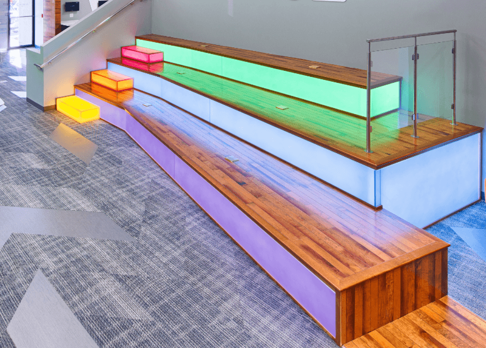
All of this ran through my head recently as I developed an interior design for an office in New Jersey. The client is a forward-thinking, tech-oriented company, but its new office space is anything but. It’s not, however, entirely void of potential. What I considered to be my greatest obstacle when I first visited the office, an abnormally long foyer, became the catalyst for my design after I gave it a bit of thought.
My overall aesthetic is modern, minimalist, sleek. Take your favorite Marvel movie and imagine the next installment set a century into the future. That’s what I’m going for here. The surfaces would alternate between etched glass and perforated and textured metals. The palette, accordingly, would be cold. Ice and steel.
And that long foyer would become a tunnel. The moment you stepped through the entrance, a gravitational pull would steer you toward the reception area, the centerpiece of the design. Like the one I had built for the Artcraft Health headquarters, the desk would be a large, sculptural piece. The kind of thing that commands your attention. But this one would be more refined, in keeping with the nature of the company.
I’d create a formal waiting room just off the reception area to help keep the attention on the desk and populate it with furniture in the same vibrant colors of the company’s logo—the only real hits of color outside of the neutral range in the entire front section of the office. And the walls of the main conference room, which also flanks the reception area, would be glass etched with triangular lines, mimicking the design scheme from the company’s site.
I’d swap out the generic ceiling tiles for textural metal plates and the high-traffic, low-thrills carpet for minimalist, synthetic flooring. And, because everything (and everyone) looks better in the right lighting, I’d pull out the stock fluorescent bulbs (which do no one any favors) and replace them with a modern, chrome fixture that sits flush against the ceiling.
A smart interior design for an office aims to inspire a little awe in every visitor. But a thoughtful one aims to embolden the people who inhabit it every day, too.