Author: Rafael Novoa
A Vacation Home Bought Impulsively Yields a Marathon (But Worthwhile) Makeover

My partner and I, we’re impulsive. I’m just going to say that right at the top. If I don’t, I worry that the premise for what follows will feel a bit … much.
Three years ago, we were visiting friends in West Palm Beach, Florida, a city that’s easy to fall for. They suggested we check out a new residential community that was being built around the corner from our hotel.
We passed under a little archway and suddenly, we were in the middle of this enchanting neighborhood made up of art deco-style townhomes, a look that’s synonymous with the area. There was an end unit with a small yard and a FOR SALE sign out front. We called the number that was listed on it and put in an offer. It was accepted.
Like I said: We’re impulsive.
That was only the beginning, of course. The home was a blank slate. The idea of making it our own was as exhilarating as it was daunting. Good thing I had no idea at that point that a pandemic was looming, and it was going to turn our already-sizable undertaking into a multi-year marathon.
Starting from scratch

Three bedrooms and three full bathrooms are spread across two floors upstairs. Downstairs, on the main floor, there’s a living room with a sky-high ceiling and tall windows, an ample kitchen with a massive island that reaches all the way across the space, a modest dining area, and a powder room. All told, the home is about 3,000 square feet.
On the other side of the large sliding doors leading from the living room, there’s a plunge pool surrounded by an intimate stone patio with sufficient room for a few lounge chairs and a dining table.
Our initial goal was to get just enough furniture in every room to make the home livable. We were so excited; we wanted to start spending time there as soon as we could.
When we returned to our primary home in Bucks County after buying the West Palm Beach townhome, we put our Philadelphia apartment on the market and shipped a bunch of furniture from there down to Florida.
Before we did that, though, we took a floorplan of the new townhome and mapped out which furniture would go where. So there was intention right from the beginning. Once those pieces were in place, it helped us see what else we needed. There was still a long way to go, but we were moving now in a more-specific direction.
An amalgam of interesting contrasts
West Palm Beach is an antique-lover’s paradise. There are more than 40 shops on Antique Row alone, many of them with formidable collections. There was one, however, Silvia Petroccia Antiques & Interiors whose every piece felt like it was hand-selected for us. We quickly fell in love with Silvia herself, too.
Over the next couple of years, the three of us developed a symbiotic relationship, in-person and from afar, with us updating her on the progress of our renovation and discussing our latest ideas for it and her steering us toward specific elements that sounded like they could be a good fit.
It’s hard to articulate a central aesthetic for our new home. At turns, there are nods to ancient Rome in the form of frescos and various statues. But, from other angles, it also feels undeniably modern.
Design schemes for vacation homes tend to be pretty simple, understandably. They’re meant to be places that offer a reprieve from life’s daily stressors, not a whole new source of them. But, while I’d like to think of my aesthetic as inclusive, match-y-match-y has never been my thing.
In fact, the new townhome lands squarely on the other end of the spectrum, with lots of interesting contrasts. In the living room, for example, an early 19th-century hand-blown Venetian chandelier coexists with Ingo Maurer sconces. A (very) limited edition coffee table by architect Gio Ponti and designer Piero Fornasetti is flanked by a futuristic, black-hooded chair and a couple of Louis XV chairs upholstered with Christian Lacroix fabric. The result is colorful and conversation-inducing.
It might seem like there’s no real rhyme or reason to the design, but there is: This is the furniture and art that we love. Each piece is a reflection of a different aspect of our personalities. And taken together, it’s a representation of us as a couple.
Shopping here and there

Hanging wallpaper wherever we could also went a long way toward giving each room its own unique identity. Every room (including many ceilings) and hallway has a different wallpaper. We even placed it on the staircase risers.
The master bedroom is wrapped in a pale pink silk wallpaper that mimics the interior of a conch shell. The en suite bathroom features Cole & Son’s retro “Palm Leaves” print. Pairing them created a distinct South Florida feel. Conveniently, the palette is also very calming.
Another bedroom is inspired by the iconic Colony Hotel, which was our favorite place to stay until we became Palm Beach residents. A bold green-and-white-stripe wallpaper complements bedding that’s decked out in watermelon-colored stripes. Both are sharply contrasted – but also balanced – by the headboard, an accent wall, and window treatments that feature an Asian tiger pattern in the same colors.
It might seem like there’s no real rhyme or reason to the design, but there is: This is the furniture and art that we love. Each piece is a reflection of a different aspect of our personalities. And taken together, it’s a representation of us as a couple.
For about a year, we managed what we could from Bucks County. Then, last March, we were finally able to return to the townhome. We spent two-and-a-half weeks trying to make up for lost time.
When we visited again in September, almost three years after when we bought the townhome on a whim, it was the first time we had the whole house to ourselves, not a contractor in sight. We dropped our luggage and tried to soak it all in. Because it’s been such a long haul, it still hasn’t quite set in that we can relax and start thinking of this place as home, rather than merely a work-in-progress. But, then, I’ve never been particularly good at that part.
Escaping Through Tabletop Styling

I usually have trouble undressing the house after Christmas, but I was almost paralyzed by the thought this year. With the pandemic still raging and the prospect of spending the remainder of winter grounded at home, the walls started to close in on me.
And then I had an idea: What if I kept on celebrating? I could repurpose some of the Christmas décor and convert the existing tabletop displays around the house into different expressions of a winter wonderland. And maybe even sprinkle in some hearts, because why not embrace Valentine’s Day, too?
My mood lifted immediately, not just because I had new project to focus on, but also because the change of scenery was going to give me a place to escape to whenever the days felt like they were blending together again. I’ve found during this pandemic that little gestures matter a lot. And make no mistake; tabletop styling is a small undertaking, even if you’ve already packed away the reindeer and tossed the poinsettias.
As a bonus, the tips below, while intended for decorating, are completely applicable to straightforward interior design, too. Have you ever noticed how a fully-furnished room doesn’t look finished until the tabletops have been styled? Yeah, that’s not a coincidence.
Contrast materials and heights.
When you’re styling your tabletop, regardless of the size of the table, try to use objects that are different heights, shapes, and materials. The contrast will add depth to the design and the room.
Place the small items toward the front of the table and the tall items in the back. If the table’s in the middle of the room, loosely cluster the taller objects around the center of the table. It’ll help draw the eye into the design. Though avoid a uniform pitch. That’ll make it look a little too choreographed. You’ll notice in the picture that the tallest object is just off-center, but there are a bunch of shorter peaks throughout the tabletop.
I also mixed in a slew of different materials, including metal, wooden, ceramic, and fresh flowers. The organic against the inorganic draws out the best qualities of both.
Use keepsakes.

Our parents treated family heirlooms one of two ways. They either arranged them in an overly-precious, museum-like display or they buried them deep in storage, where no one could appreciate them.
They’re much easier to fold into the mix around the house when you have a more casual attitude about them, like, um, using them in a decorative tabletop design. And the stories behind them will help to personalize the room.
This beautiful turquoise French glassware from the 1920s was given to my parents as a wedding gift. The color’s so unusual that it catches your eye from everywhere in the room. It means a lot to me because it belonged to my parents and it’s kind of a one-of-a-kind collection (to me, at least). And yet, I’m not above throwing a sparkly reindeer into the mix.
Follow basic composition rules.

Remember what I said earlier about making sure your tabletop doesn’t look too measured? Well, there’s a continuation to that thought, and it starts with but. Your tabletop shouldn’t look measured, but it should be well-balanced, just like any attractive piece of art.
There can be a tendency to think that more is better in these instances. But there are lots more opportunities where a handful of objects can make all the difference. After all, how many huge tables do you have in your home?
In this design, which sits atop a table that resides inside our front door, I made do with only a few items, and some of them were carried over from Christmas. But it also turned out to be my most imaginative one, evoking an enchanted forest that’s straight out of an age-old bedtime story.
No, you don’t need to spend big.

Finally, and maybe most importantly, the things on your tabletops don’t need to be pricey or precious.
I indulged my inner-florist with some of these designs, but only because fresh flowers make me really happy, especially in the dead of winter. But everything else is stuff I either collected through the years or bought very inexpensively, like these little novelty hearts I added to an existing berry arrangement on our bar.
If something’s beautiful to you and it helps you tell a story, ultimately, that’s the only criteria that matters when you’re searching for objects to style your tabletops.
Take Comfort in the Beauty of Being Home


It was easy to believe this was all going to blow over in a couple of weeks. After all, what didn’t blow over in a couple of weeks BC (before coronavirus)? It’s clear now, though, that this virus has reshaped our reality in significant ways that will be long-lasting and, in some instances, even permanent.
Being separated from friends, not being able to dine out, and being largely relegated to our homes have been tough pills to swallow. But, with each day that passed, a funny thing started happening: My appreciation for life’s simple pleasures began to grow. A FaceTime conversation will lift me for hours. I’ve always loved to cook, but I rarely had the time to do it—until lately.
And maybe most significantly, I reimagined my home as a safe haven, which really wasn’t much of a leap, but it was something I’d unknowingly taken for granted. As an interior designer, I’d always understood the importance of surrounding myself (and my clients) with meaningful things. They give us agency over our spaces. And at a time when we’ve been reminded that so much of life is out of our control, that feeling is invaluable.
With that mind, I started scrolling through images of a few of my favorite spaces, some I’ve called home and others I’ve designed for clients, in search of the ones that make the idea of quarantining a little longer feel like a welcome invitation. This is what I came up with.
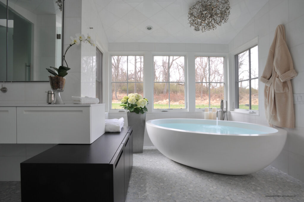
A tub at the end of the world
Looking at it now, this massive Boffi tub that’s as heavy as it looks belongs in this cozy nook with windows on three sides that provide a panoramic perspective of an unadulterated stretch of woods. But back when this sprawling bathroom was still an empty space, there was some question as to where it would land. Ultimately, it felt more like a sculpture than a tub, and, as such, I wanted to give it a proper exhibition space.
A soaking tub filled with warm water is, of course, plenty soothing all on its own. But what’s always caused the tension to loosen its grip on my shoulders is this bathroom’s minimalist design, right down to the mostly-white palette. Aiding in that regard is the cabinetry, also designed by Boffi, and the Thassos marble wall and ceiling tiles. So white they can appear to glow, this bathroom practically sparkles when the sunlight streams in.
Meeting in the middle
I know plenty of people who would have taken one look at this long, relatively narrow “dining room” in a retrofitted barn and known immediately what to do with it: Install a monumental dining table of the Game of Thrones ilk. I went in the opposite direction with smaller dual dining tables, one at each end of the room, and filled in the middle with this intimate lounge area.
During dinner parties (back when that was a thing), it’s an ideal spot for sipping on cocktails and munching on hors d’oeuvres, particularly because it offers a prime view of all the action in the kitchen. And the candelabra, which comes from a 17th-century French church, is always a conversation starter. But it’s also the most tranquil spot in the morning. When it’s warm outside, I’ll open the double doors and let the breeze blow in from the valley while I nurse a cup of coffee and ease into the day.

Home is where the cooking’s done
Design icons Sister Parish and Albert Hadley were my inspiration for this hyper-modern kitchen. Their spaces were the height of decadence, overflowing with rare antiques and luxurious textiles. But their kitchens were austere because they believed the food should provide all the color.
What I like most about this kitchen is that it’s deceptively functional. The Boffi cabinetry may be minimalist, but it’s hiding a ton of storage. And the large island, I’m sure, seems like a curious choice for a relatively tight space, but it doubles as a workstation, complete with a four-burner stovetop, and a comfortable, three-seat dining area.
That kind of versatility is key because, increasingly, the kitchen is the room in the home that we gather in the most. Back when we were all leaving the house on a daily basis, it’s where we were most likely to catch up with each other at the end of the day and share viral videos long after the dinner table was cleared. Now, it’s where we check in with each other and crowd in front of laptop screens for virtual happy hours.

An exotic escape on the other side of the door
Finally, this collection wouldn’t be complete without an outdoor space. More than ever, we need a way to socially-distance from our heads at least once a day (or hour). If that escape’s sitting right outside, all the better.
This walled-in deck was blissfully private to begin with. But with each new potted plant—which I was constantly adding—it became a lush oasis. I’ve always enjoyed gardening and landscape design. And I’m particularly drawn to dramatic-looking tropical specimens and topiaries. Here, they seemed to absorb the noise of the world outside and amplify the serene sounds within, whether that was the crackling of embers in the outdoor fireplace, the trickling from a wall-mounted fountain, or a quiet conversation around the dinner table.
Details, like the Harry Bertoia chairs and bronze clay ceramic pots, are always important. They underpin the thoughtfulness of the design and help shape the experiences that are had within the space. And, yes, those experiences are the most vital part of a room’s impression. But in time, the details become touchstones that make it that much easier to reference the experiences. In that way, our homes are always comforting us.
From the Ruins of a Bucks County Barn, a Modern Castle Rises

When my client brought me to her property for the first time, there wasn’t much to it.
It sat along a bucolic stretch of Meetinghouse Road, just off the beaten paths of New Hope. But the only structure there was a dilapidated barn that was years past the point of serving a purpose. Eight Bells was still a ways in the future at this point. I’d designed other barn-home renovations, but none of them were as challenging as this one appeared to be.
The walls were spotted with large holes. The roof looked like it was about to succumb to the next big storm. The floor was nonexistent. And the foundation was starting to erode in spots.
I’ve done this long enough that I can see through pretty much anything and imagine the possibility, but I was straining that day to align my client’s grand plans with the ruins that were literally crumbling in front of us. She and her husband, however, saw something in it, so I would, too. Or, at least, I’d fake it until I could.
Minimalist doesn’t mean austere
My fears about the barn were a little premature. It didn’t turn out to be in better shape than I thought or anything like that. Rather, it became a slog to reach the point when we could even do anything with it. Three years passed while all the necessary building permits and approvals were secured.
Early on, at least, the builder moved a trailer onto the property, and my client and I started meeting there regularly. During those sessions, we began filling in the details. Gradually, the look and feel of the home became something tangible. Sometimes it was just the two of us. Others, the architect joined us.
It was pretty obvious to me from my introduction to the client that we were going to be fast friends. I admired her right away. She’s kind, compassionate, and outgoing. She also has exceptional taste. In spite of what we were working with, she wanted a modern, minimalist home, one with lots of glass and steel. There was very little doubt in those early days. We started moving decisively toward that end and only gained momentum with each element.
In part because of that and also because I worked as an architect before I became an interior designer, she asked me to be a part of her meetings with the architect. It was a way of ensuring there’d be little deviation from the course we’d started to map out.
When we weren’t in the trailer, planning, we were in New York, shopping. Even though she and her husband had a home there, I found a ton of pleasure in introducing her to designers and shops all over the city, like Boffi and a Scandinavian chandelier-maker who’d just opened a gallery in Soho.
Without a deadline looming right overhead, we relaxed, for the most part, and became very meticulous about finding just the right furniture, fixtures, and fabrics.
What about the walls?
Reality set back in almost as soon as construction began. A steady stream of issues felt more like an actual stream after a week of heavy rain through much of the four years that it took to piece this modern, minimalist barn-home together. (That’s right; it was about seven years, all said and done.)
It turned out the foundation wasn’t really eroding so much as a significant part of it was missing. An engineer solved that issue with a genius and minimally-invasive idea. But that crisis was no sooner solved when another cropped up. And another.
One of our biggest headaches proved to be what to do with all the electrical conduits and HVAC ducts. The walls are fewer and farther between in a barn. And most of them are, more or less, exposed to the studs. Much as we overhauled the existing barn, we went to great lengths to ensure that we maintained much of the original integrity, restoring missing beams and limiting many of flashiest structural features to the new-construction additions.
We ultimately opted to run the conduits and the ducts along the ceiling, which gave the space a loft-like feel that played right into our modern, minimalist aesthetic. That it also created a very cool geometric pattern was icing on the proverbial cake.
A few of my favorite things
Like any designer, I couldn’t name a favorite among my projects. They’re my kids. But Meetinghouse Road, undoubtedly, will always hold a special place in my heart. The client remains a good friend. And it’s hard not to be really proud of what we accomplished with the home after investing so much time and energy in it.
Almost every corner holds a positive memory for me—though, in some cases, that memory overrides an earlier moment or two that makes me cringe—but there are a few parts that make me beam, even now, because the result so far exceeded my expectations.
The massive steel-and-glass doors at the entrance are one. They’re meant to be a modern update on the traditional barn-door design. What they ended up being is a fitting first impression for a dramatic home. The craftsman, who I’ve been working with ever since this project, also designed the steel-glass-and-wood stairwell, which became another signature feature the instant it was installed.
The ground-level floor is filled with highlights, too: the stainless-steel bar and fireplace; the uber-minimalist kitchen (which is not the home’s main kitchen); the bathroom, whose walls are covered, floor to ceiling, in little metal coins. And there’s a wall in the lounge that came to represent just how attuned the client and I became.
I wanted to highlight one of the barn’s original stone walls by bolting some thick glass panels to it. The idea came from a recent trip to Pompeii. Most of the ruins there are exhibited the same way. As it turned out, she’d visited there too and loved the idea.
To their guests, the glass wall looks like another modern, minimalist extension. But she and her husband can appreciate it as a symbol of deeper meaning, which, when you think about it, is how a home should be. Interior design plays a central role in our lives, but it can’t be expendable. There needs to be more than meets the eye.
Where to Invest When You’re Preparing Your Home for Sale

A couple of posts back, I shared some personal news. After a trying winter, we decided to sell our home.
An especially brutal end to the winter may have been the tipping point, but it wasn’t a decision we arrived at lightly. Making a home is never a half-hearted effort. I know as well as anyone. Over the course of a long career as an interior designer, I’ve witnessed all kinds of sacrifices that were made in the name of shaping homes into some ideal mold.
We’ve made them ourselves. When we first laid eyes on our barn, it was a shadow of itself after years of neglect. Nothing about its transformation was easy, especially in the early going, but, with each completed project, the barn revealed another piece of itself to us, and us to it, in turn, just like a true relationship.
Compound that with several years’ worth of memories, each of them feeling like a reason stay. But as we started looking around, we both felt that tinge of excitement that comes with possibilities you never knew existed just an hour earlier. And even though we didn’t find anything to settle our attention on, we came to realize, at least, that our hearts weren’t in the barn anymore. Not truly.
Preparing a home for sale has become its own kind of niche, and I don’t want to present myself as an authority on it. But, since it’s consumed much of my time and most of my thoughts for the last few months, I thought it may help to share a few of the most meaningful things I’ve done along the way.
Start at the bottom
However little someone may know about home construction and craftsmanship, I promise you that they know enough to gauge the state of the flooring. In fact, the first place they’re likely to look when they walk through the front door is down.
Carpet and tile are very taste-driven, so no one’s likely to buy a home because they fell in love with the carpet in the master bedroom or the tilework in the kitchen. But they may be enough of a disincentive to walk away from a home with that’s a strong maybe.
Just make sure that yours is presentable (read: clean)—unless it’s obviously dated or worn. In which case, replace it with something from the economical end of the spectrum and a neutral palette. It’s probably going to be replaced after the sale anyway.
Invest here
Similarly, a fresh coat of paint, inside and out, is a relatively easy upgrade. Again, think safe colors (white, khaki) and economical materials.
The bulk of your budget* is going to go toward the kitchen and the bathrooms. (*Before you set any of this into motion, nail down a budget. More than anything, it’s going to prevent you from over-investing.) These hold the most weight for buyers, so they command the most scrutiny.
In the bathrooms, paint the walls white—there’s no room for creativity here—and swap out any outdated fixtures. That includes the sink and toilet. (It should go without saying, but, also white.) If your bathrooms haven’t been touched since the Clinton administration, this won’t be cheap, obviously. But, whatever you invest now, you can expect to get back in the sale.
Same goes for the kitchen, mostly. The walls don’t need to be white, but the appliances and the counters should be contemporary. The kitchen is the heart of the modern home. In turn, it’s where buyers are going to make sweeping judgements, founded or not, about how well you’ve maintained the home. If they walk into an all-white kitchen that looks like a page torn out of the May 1998 issue of Better Homes and Gardens, they’re going to assume the rest of the home is stuck in the same era.
Pare down and spruce up
If you’re a professional interior designer, thank you for reading. Also: Disregard this part. Everyone else, once you’ve done the heavy lifting, pare down. That means, pretty much, removing all signs that anyone’s living in the home. We’re talking magazines, the kids’ toys, everything currently occupying the kitchen counters, personal photos.
We’re accomplishing two things here: We’re decluttering and freeing up some valuable space. We’re also making it all that much easier for a prospective buyer to envision themselves living here. Mementos can feel like pop-up reminders that this is—and may always be—someone else’s home.
And, last, stick a large floral arrangement square in the center of the foyer (or something close to that). For good measure, make sure the planters flanking the front door are refreshed, too. They’re thoughtful gestures that’ll help make a good first impression.
When you start preparing your home for sale, especially your first one, it’s easy to go into denial. It’ll sell itself. Or, just as bad, to start renovating without a solid plan or budget. Wade through the emotion to get to a place where you can think clearly and objectively. It’s there. Trust me. And understand, every home’s going to require some investment. The smarter you are about choosing where to make yours, the greater the return’s likely to be.
Same Old Floorplan, But a Fresh, New Interior Design

Some of my favorite makeovers were the most troublesome ones at the onset. Take one of my latest projects as an example. The floorplan is outdated and uncompromising, the budget is tight and just as uncompromising, and, because misery invites more misery, the entire condo needed to be renovated and outfitted in less than two months.
The Philadelphian, where this 1,200-square foot condominium resides, sits in a prime location, right off of Kelly Drive and within shouting distance of Boathouse Row, the Schuylkill Rowing Basin, Fairmount Park, and the Philadelphia Museum of Art. In its day, it was the height of condo living in the city. The laundry list of amenities includes indoor and outdoor pools, on-call housekeeping, its own grocery store, and a complimentary shuttle to Center City. The trouble is, that day was more than 40 years ago.
Paring down
The Philadelphian, today, isn’t quite as sleek or as accommodating as the newer residential buildings around the city, but it’s still got that location. And, as real estate brokers are fond of saying, that’s what matters most. I tend to agree. Everything else can be improved, but you’re never going to be able to enhance the view or the accessibility to the best of what’s around you.
So, with that mindset, we began pulling out almost everything we could. The kitchen and master bathroom were stripped to the studs. All of the electric and flooring came out, too. We didn’t knock down any walls, so there weren’t any significant changes to the condo’s architecture. But, we cleared out almost every other relic from its prior existence.
The new interior design is something I’m describing as traditional in transition. Essentially, I’m taking some traditional elements and featuring them in contexts that are very much of the moment.
In the living room, for example, the furniture features hints of driftwood gray, aqua, and champagne, a lighter palette that positively pops against a dark rug. The rug also has the effect of enlarging the room. Floral-patterned pillows provide the accents and help tie the living room into the dining area. It’s not a large space, so I had to get creative with the layout. On a day-to-day basis, there will be three chairs around the dining table. But, for dinner parties, there’s enough room now to accommodate as many as 12. Those other chairs will be pulled from all over, including the living room.
The eclectic look of different kinds of chairs (and a couple of ottomans) is page right out of the modern designer’s style guide. I’m even happier, though, about the super-efficient use of the space. That, right there, is the essence of modern living.
You don’t need to abandon your identity to live in a modern home. Really, it’s just a matter of updating your living spaces so that they don’t begin to feel stale. Sometimes, a fresh coat of paint in a trending color or a new, contemporary wallcovering is enough. Other times, you’ll need to be more invasive, because it’s about function as much as the look; your home needs to evolve with your lifestyle.
Walls aren’t everything
It’s not that abnormal. If you went strictly by what we see on TV anymore, then, sure, the retrofitted modern home is an open space, and many walls were likely sacrificed in its making. But, the reality is, knocking down walls costs a lot of money. Not to mention, in apartments and condos, like this one, it’s often not even feasible. So, updating and upgrading an existing space is a familiar place for me.
Is it constricting? Totally. But, as creative types are fond of saying (after they’ve found their way to the other side), the limits are what inspire innovation. I believed that myself right up until the building’s management asked us to install the new washer and dryer according to the current code, when the set we were swapping out had been there, I’m pretty sure, since the first Bush presidency. There was no innovation there; just a giant headache.
Playing up the view
But, even that, I’m sure I’ll laugh to myself about as soon as I hand the keys back over to my client. By then, I’ll have taken a condo that felt like the walls were closing in and reshaped it into a living space that’s open, uncluttered and accommodating. The view’s still going to be there, of course, but now, instead of feeling like the one and only focal point in the place, it’ll become a fitting backdrop to a home that’s filled with lots of points of interest and unobstructed views from which to take it all in.
Amenities, after all, are great, but home is where the heart is. If you’re at peace there, life has a way of falling into place within its walls and everywhere else.
3 Pieces of Advice for Your Kitchen Renovation

This is going to sound sacrilegious coming from an interior designer, but I design kitchens to be functional above all else.
I cook, so I know the difference it makes having everything I need within reach and set up in a logical layout. You may stand in the doorway, admiring your kitchen, before flicking off the lights at night, but if your prep area’s on the other side of the room from the sink and the island separates the fridge from everything, your kitchen’s not fulfilling its basic purpose.
We’ve all come to appreciate the value of a kitchen renovation. It’s one of the most meaningful upgrades you can make to your home, whether you have an eye toward selling it sometime soon or you simply want to enhance the time you spend in it. But the kitchen renovation can also become a money pit when you let Pinterest take the wheel.
What follows are a few basic guidelines I’ve honed through countless kitchen redesigns. This isn’t intended to be a comprehensive strategy. (What use would you have for the likes of me, then?) Rather, it’s meant merely to steer some of the most critical decisions as you start to figure out what you really want from your kitchen.
Design around technology
Again, this is probably going to seem a bit out of line for an interior designer, but I start with the major pieces of equipment—the fridge, the oven—and design my kitchens around them. In this one room, technology should rule.
It goes back to designing the kitchen to be functional foremost. The equipment’s going to dictate the layout. And, in doing so, they also become the focal points. So, search for what you need and then find the most stylish pieces that meet those requirements.
I’d build my dream kitchen around a La Cornue oven. It’s this massive hunk of equipment, but the design is so thoughtful, the oven reads more like a piece of custom-crafted furniture. Not to mention, it’s a cook’s dream. I also pine for a glass-front refrigerator.
Once the equipment’s ordered, practicality should guide your decision-making. Envision yourself moving about the space, and ask the questions that come naturally: Where’s the glassware going? How much room do we need for cookware storage? Do I need the pantry within easy reach or can I tuck it around a corner?
For one client, recently, I installed a mini-fridge and a microwave, side by side, in the island so that the kids could grab their own snacks when they got home from school. It was a pretty simple thing to pull off, but it’s had a big impact. It’s kept them from rooting around the kitchen and, more importantly, pestering mom to no end.
Bottom line: A kitchen renovation is your golden opportunity to shape the most active part of your home according to your lifestyle. Take full advantage.
Design the kitchen you want, not the one you want to sell
HGTV’s made us all a little (a lot) too conscious of the way our homes appear to potential buyers—even as the thought of selling our homes would never otherwise have crossed our minds. And the kitchen’s caught the brunt of that because, like I said, it’s one of the most significant upgrades we can make to our homes.
Inevitably, I reach a point with many of my clients where they’re caught between what they really want for their kitchen and what they think they should want. My advice is this: Design the kitchen you really want. Unless you’ve got a FOR SALE sign sitting out front, this kitchen is yours to live with. It could be months, it could be years. Either way, make the most of that time.
That said, if you’re planning to put your home on the market the instant your kitchen renovation’s done, an all-white palette is a smart move. It’s sort of like a blank canvas for potential buyers, because, no matter how impressive your style, the chances are good that your home’s next owner is going to want something else.
Design with an eye on the bigger picture
The kitchen is the heart of the modern home, but that’s not entirely its own doing. The modern home has a lot fewer walls than the ones we grew up in, which has made it much easier to gravitate to the kitchen.
If you’re entering into your kitchen renovation with an open-concept floor plan, do everything you can to preserve it. If you’re not so fortunate, take a step back and talk with an architect or an interior designer. It’s not as simple as removing a wall that stands between the kitchen and the living room. Structural concerns aside, you’ll need to figure out how to replace the storage that’s disappearing with that wall. That’s the tricky thing about kitchens: Every wall serves a purpose.
I recently opened up a galley kitchen in a Center City apartment, and, in doing so, not only replaced the cabinetry we removed, increased her storage. There are plenty of ways to go about it, but there are even more ways that it could go horribly wrong. When you start tearing down walls, it becomes more than a kitchen renovation. Plan accordingly (with a professional) and you’ll be fine. Try to figure it out as you go and you’ll end up with a patchwork living space.
One last note: Removing walls is expensive. On TV, they come down and support beams go up in the literal blink of an eye. In real time, they’re a mammoth undertaking. But there are ways to cut costs in other spots of your budget that no one will ever notice, including you.
In the Center City apartment, for example, we went with porcelain tile over stone. And the faucet and sink are from Home Depot. I promise you, though, you never would have guessed it if I hadn’t tipped you off.
Update: A Philadelphia Interior Design Project Enters the Homestretch

Flipped through the May issue of Philadelphia Style yet? Not to brag, but I’m featured in its Philadelphia Faces of Design portfolio (page 137).
I’m humbled to be among such esteemed company in a magazine that I respect greatly. Thank you.
In honor of the occasion, I thought I’d update you on a Philadelphia interior design project that’s entering the homestretch. When we last left our bachelor’s apartment at the Ritz-Carlton in Center City, the wall coverings had just gone up. They were the first meaningful strides we took toward our bold, modern aesthetic.
I used fabrics usually associated with clothing—linen, wool, suede—much of them lined with pinstripes of various gauges. Basically, I dressed his walls in some beautifully tailored suits, which made the installation more like a fitting.
If that wasn’t dramatic enough, I divided the apartment into two distinct halves. The front, where the foyer, living room, and kitchen reside, is all black. The back half of the apartment—the master bedroom and bathroom—is almost all-white. I may also incorporate some navy by way of the bedspread to play off the navy pinstripes in the wall coverings. And all of the metal details will be silver.
My concept for this particular Philadelphia interior design project was inspired by a single piece of pre-existing furniture: a black-lacquered, art-deco credenza. The homeowner wasn’t entirely sure what he wanted for his apartment, but he knew he loved that credenza. I did, too. So we went from there.
Let’s talk about the bedroom
His taste inspired the modernism, but the apartment itself inspired the design for the bed in the master bedroom. Apartment living, even at the Ritz-Carlton, requires a certain amount of efficiency. So I created a bed that’s more than meets the eye.
I upholstered the entire stretch behind the bed, from one corner of the room to another, which created the effect of a paneled leather wall. It may not seem like a big difference from a headboard, but it feels like there’s one less bulky piece of furniture in the room. Beside the headboard, it also spared us from some light fixtures because I installed lighting within the panel to up-light the wall behind it.
But the most unique feature is a secretary desk that’s built into the panel on one side of the bed. A discreet door flips down and exposes a surprisingly large workstation with enough room for a widescreen desktop monitor.
If you work from home on occasion, or even just need a space to tend to some personal bookkeeping, you’d be surprised with how little space you actually need when take a couple of moments to think it through. The necessary tech is about the size of a magazine, so you can’t blame that for your garish makeshift office in the corner of the kitchen. And there’s no reason to keep the few paper files you need in plain sight. There’s no reason to keep any of it in plain sight, actually. Streamline.
That frees up more room for things that you and your guests want to see, like the mirrored Gueridon round-table and the two-drawer, marble-top, art-deco chest from France I added to the master bedroom last week. The demilune chest features a scalloped face finished in silver leaf. It’s the kind of piece that immediately elevates a room and only grows more interesting the more you study it.
The installation of the art finished off the bedroom. I placed a single large photograph over the bed. And the opposing wall features a block of four three-foot by three-foot prints. Together, they act like a giant exclamation mark for the bedroom’s brash design.
Filling in the missing pieces
As I write this, much of the living room furniture, by way of the Netherlands, is going in, including a marble and chrome coffee table that looks like it belong in the Tiffany & Co. Atlas collection. The sofa is flanked by chrome side table and a black-lacquered bar by the French designer Jacques Garcia.
Opposite from the sofa, a custom-crafted Madagascar chest (pictured) conceals an electric keyboard. (The homeowner plays.) I placed a chrome étagère on each side and art deco consoles and drink tables throughout the open spaces around the remainder of the living room.
Still to come: a pair of upholstered, art-deco chairs, a Mies van der Rohe Barcelona chair, some Murano lamps, a few pieces of artwork, and a bit of accessorizing.
Having such a minimal palette with this Philadelphia interior design project would seem to allow many of the other elements to fall into place a little more easily. But the opposite is true in most instances. The homeowner and I recently made the final decisions on the last batches of accessories—mirrors, lamps, and a couple of custom-made area rugs from Beatrice & Martin that proved trickier to design than I anticipated.
The challenge comes in creating nuance and having it all appear to be harmonious. The last think you want in a room that’s all-white is a pure-white sofa that’s surrounded by a bunch of things that look like they’re supposed to match exactly, but, instead, they’re a shade too light or four shades too dark. (Just as bad is if you did manage to match that sofa.) But if you can establish a spectrum of slight gradations, it’ll create depth and texture.
For one of those rugs, we went with four different creams accented by a bit of silver. The contrast will come not through the colors—there’s not enough difference among them to create much separation—but through the materials, wool and silk.
Seeing an interior design come to fruition, especially one this extensive, where we touched every surface and corner of the apartment, is always a bittersweet moment. There are turns in every project that force you to wonder how you’re going to find your way to the other side, and this one certainly wasn’t short on them. But the result is even more overwhelming. Something that lived inside my head for several months, sometimes even longer, is now right in front of me, in full view. And I can’t help but feel, when I walk out the door for the last time, that a small piece of me will stay behind.
Home is Where the Heart is—Until it isn’t

I stood at a window one morning recently, taking in the yard. The landscaping, specifically. Spring was here, but it was cold and overcast. Nothing was growing yet, not even the random tufts of crabgrass.
To the contrary, my eye moved among all the damage that was left behind by a series of bad winter storms that came through in March with high winds and a couple feet of wet, heavy snow. Before I could take stock of what needed planting and replenishing, there were a slew of downed limbs—a couple of which crashed through a fence—and countless smaller branches that had to be cleared first. A lot of the trees, grateful as I am that they remained standing, were going to need pruning, too.
These last few weeks were a harsh parting shot to what already felt like a relentless winter.
Interior designers are human
There’s this misperception that, when your work is making homes beautiful, your own is in a constant state of readiness for the next photo shoot. And I do pour a lot of energy into refreshing our spaces with each season and updating our most-used rooms—the living and dining rooms, the foyer, the kitchen, and the master bedroom—but I arrive at the start of spring with a punch list of things that need to be done in and around the house, just as I imagine most of you do.
This year, my list is running longer than usual. There’s the storm damage. But even before the first nor’easter barreled through in early March, we’d already long since settled into a what-next rhythm this winter. In early January, amid a bitter-old stretch, a pipe froze and ultimately cost several thousand dollars to repair. Then a heater in the master bedroom—newly installed only two years ago—broke down on us. And then we went without heat for five very long days when we ran out of oil.
I realize we all have our gripes with winter, and mine are no more traumatic than a handful you could probably rattle off right now—probably are rattling off to yourself as you read this. It’s why we walk around during those first truly spring-like days with a euphoric-but-desperate expression, like we were saved from the remote island just before we were about to eat the other survivors.
But so far, I haven’t felt that. Instead, I felt the weight of everything that needed to be done around the house. And I didn’t know if I had it in me.
Breaking up is hard to do
Even when all the signs seem to be pointing in that direction, moving on is a hard thing to come to terms with. Especially when you’re literally moving. Making a home is never a half-hearted effort. I know as well as anyone. Over the course of a long career as an interior designer, I’ve seen firsthand the sacrifices we make in the name of shaping our homes into some ideal mold.
Just like any of us, I believe a home can’t reach its full potential until it has someone to believe in it. When we first laid eyes on our barn, it was a shadow of itself after years of neglect. Still, we knew it was exactly what we wanted. Nothing about its transformation was easy, especially in the early going, but the process was invigorating. With each completed project, the barn revealed another piece of itself to us, and us to it, in turn, just like a true relationship.
But this feels different. So what, in response to that, started out very much as a conversation about hypotheticals, quickly progressed to us touring plots of land nearby and discussing building a new home from scratch. Nothing was a good fit, though. We’re still too invested, emotionally, in the barn to make a sensible decision. The view was never good enough, the property, not as secluded as where we are now.
We have, though, come completely around to the idea of starting anew, building a home entirely free of compromise. (And half the size.) So, this spring’s punch list has grown further still and taken on a greater urgency as we prepare the barn for sale. The projects we planned during those five days without heat to give us hope—the shade garden near the entryway, adding an architectural fence to the veggie garden in the back—they’ve been bumped down the list in favor of replacing windows and the perimeter fencing, refinishing the tennis court, painting the exterior, and making over the two guest bathrooms in a more neutral (read: buyer-friendly) palette, the sorts of improvements, basically, that are going to have a direct impact on the sale price.
The thought that this summer will be our last here is still hard to grasp. Even though, if you’d floated the idea a month ago, we’d have run downstairs and packed our luggage without even asking where we were headed. The barn opened up a new world to us, so we have to trust that wherever we make our home next, it’ll do the same.
About Our Process—A Day in the Life of an Interior Designer in Philadelphia

So much of what an interior designer does is seen in a series of edited glimpses for heightened dramatic effect. The kitchen, or the space formerly known as the kitchen, stripped to its shell. The newly adorned living room, complete with the lighting dimmed and the coffee table books stacked just so.
The beginning and the end; that’s what the TV producers and magazine editors found stirred the greatest reaction. You can’t fault them. No one’s ever been inspired to redesign their master suite by watching wallpaper go up. But once it’s up—different story.
The result, though, is a culture obsessed with making over its living spaces (good for me), but with little idea of what that actually entails (not so good for me). So, in the hope of aiding both of our causes, I thought I’d fill in some of the details of how our firm, Rafael Novoa Interior Design, an interior designer in Philadelphia and its suburbs, approaches a new project.
Oversharing is not an option
You’re hiring me for my expertise (I hope), but the heart and soul of this redesign is your desire for it. Your lifestyle and aesthetic will inform every decision that’s made. This isn’t, after all, some showroom. It’s your home. So what we’re striving for is the best version of yourself.
Accordingly, I approach our first meeting more like an interview and try to encourage you to tell me as much about how you and your family live in your home as you’re willing to share. Your lifestyle’s a critical piece because, whether you realize it or not, it was most likely the catalyst for this redesign. We’re constantly aware of the aesthetic and nurture it accordingly, but it’s when our homes start feeling like they’re working against us—there’s not enough storage or the kitchen’s somehow morphed into the home office—that we finally decide enough is enough.
I’ll do my own looking around, too. Sometimes behaviors become so ingrained that we stop considering them concerns. Clutter’s my first tip-off, but there are a host of other signals.
We’re going to talk about your ideas as well. In my experience, as an interior designer in Philadelphia over the last two decades, I’ve found that clients, more often than not, are somewhat timid about sharing, either because they figure that I’d take it as an insult or they’re not entirely confident in their own sense of style. But the more you can tell me, the easier it makes my job. So, pull out the magazines you’ve been saving, or, better yet, let’s scroll through your Houzz profile or Pinterest boards together.
So, what’s this going to cost?
I never shy away from talking about the budget. But the amount that we’ll end up with is typically miles from what we’ll initially discuss, regardless of how free-wheeling or budget-conscious you are. Of course, if you give me a hard and fast number, I’ll stick to it. The tendency, though, is to want to do more.
I’ll ask during our first meeting how much you’d like to spend. But the actual budget likely won’t be set, more or less, until I return to make my presentation. At that point, with the concept boards and swatches laid out before us, you’ll have a more accurate feeling for what each facet will cost and what you can and absolutely cannot live without.
And when I see where your priorities lay, there are adjustments that I can make to ensure the design accommodates them. The floor plans play a central role in that regard. If, say, the proposal calls for replacing all of the furniture, we can reevaluate the spaces and maybe decide instead to refresh only the most visible pieces.
The presentation, essentially, is where the design comes into focus. I’ll come armed with three or so samples of everything—enough to give you a feel for the variety within the aesthetic, but not so much that you’re inundated—from the floor (rugs) to the ceiling (lighting), along with concept boards that’ll put everything into context. I’m showing you what we could do, and you’ll tell me what you really want to do.
Taste is a personal expression
The interior designer-client relationship is a unique dynamic. I’m hired based, at least initially, on the strength of my portfolio. But then I’m tasked with shaping an environment in the mold of the homeowner. The unspoken understanding there is that our aesthetics align. But that isn’t always the case.
In a number of instances, the only common bond between myself and the client was an eagerness to redesign the living space. But contrasting styles isn’t the deal-breaker you’d think it would be. It’s kind of like cooking in that way. I may be a classically-trained French chef, but that doesn’t preclude me from admiring, and occasionally implementing, Korean techniques, or Northern Italian, or old-school Southern. It’s all delicious when it’s done right.
Remember, the heart and soul of the design is your desire for it. It’s my job as the fortunate interior designer in Philadelphia that you selected to elevate that look. Sometimes it’s as simple as playing down a piece of heirloom furniture or an abrasive piece of art. Other times, I need to get a bit more creative and complement that wall color you adore so much with a more neutral, contemporary hue.
I have no doubt that we’ll hit it off famously. But even if we talk different languages, I’m not there to impose my will. I’m there to help your home look and feel like your little slice of utopia.